
I spent over a year to finish all the tutorials in this book. I’m impressed by the organisation and content presented throughout the book – easy-to-digest information, bite-sized tutorials, differentiated themes as well as detailed characterisation of the different genres presented to us in our daily lives. All of these were useful in getting us to become not just familiar with, but also sensitive towards all these different aspects, so as to create relevant and applicable designs that serve their purposes. The last chapter of the book effectively sums up all the short-cuts and application tips that could be used in the software, many of which are new and exciting tricks even for myself.
Here are a few of my favourite self-creations from a handful of tutorials in the book:
1) Line Art

This style employs a photo as its starting point to create a stylised caricature featuring black outlines that trace the basic features and then applying a basic palette of colours to replace the original ones in the photo.
2) Pop Art Comic

The early 1950s’ comic strip features can be reignited in various ways as shown here – font (CAPs, italic), background texture (pixelated dot screen), black outlines of text balloon and graphic elements as well as the loosely painted colours at the edges of the main object.
3) Picture Postcard

The scenic photos are added into the postcards using clipping masks of equal-sized boxes. I’m impressed by how easy it is to use the Image Warp tool to create the 3-D illusion of a card on a surface, as if a real postcard is placed in front of me right now.
4) Medieval Manuscript
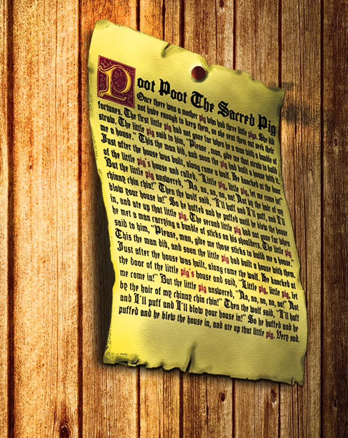
This is my favourite artwork of all, created from scratch in 2 stages: (1) doing up the 2-D manuscript using appropriate textures, fonts as well as sufficient burns around the edges; (2) introducing another background and warping the manuscript to build a 3-D perspective of the scene.
5) Cereal Boxes

As it was necessary to design all dimensions of the boxes separately at the initial stage, the anticipation of how the end product would look like made this tutorial particularly engaging. But before that can happen, a close examination of real products sold off the shelves of supermarkets is required. Features of cereal boxes include bright, chunky words, appetising hues as background colours and highly exaggerated wording of the nutritional values.